

Colour Contrast, Wayfinding and Accessibility Standards
Healthcare buildings are primarily used by people under stress, in pain, distracted or unfamiliar, whether that’s elderly patients, partially sighted users, those with cognitive impairment, first-time visitors, or children accompanying adults.
In these environments difficulties with wayfinding can lead to missed appointments, staff interruptions, patient anxiety, and delays across the service that increase congestion in reception areas. More often than not, these navigation failures are environmental, not just signage-related, as buildings communicate through universally understood visual cues before written information. The BS 8300 regulations are about usability and independence and highlight colour contrast as a primary tool for intuitive navigation. Buildings that are easy to understand not only feel calmer and safer but also reduce pressure on staff and use accessibility to improve operational efficiency and compliance.
To help architects and specifiers achieve BS800 best practice, in this blog post we have simplified the core requirements for creating inclusive, accessible environments through effective wayfinding.
Why wayfinding fails
Spaces designed with modern interiors often use minimal detailing, flush doors, concealed frames, monochrome palettes, and matching finishes. These elements remove the visual hierarchy within the space, making it difficult for users to identify where doors are and which routes are available to the public or staff.
This is particularly problematic in healthcare settings where insufficient wayfinding can lead to wandering patients, interrupted consultations, and staff needing to escort visitors. For those with dementia, cognitive impairment, or partial sight, spaces become especially difficult. Dementia patients often rely on visual recognition rather than memory, while partially sighted users can detect tonal differences more than colour. For these individuals, poor wayfinding becomes a significant obstacle that can lead to distress or dissatisfaction with their care.
When done properly, wayfinding can help users navigate the largest facilities, because large buildings aren’t the issue; unclear buildings are.
What BS 8300 requires (in plain English)
Visual contrast (LRV)
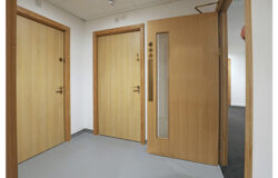
The term ‘LRV’ means light reflectance value, a measurement for how light or dark a surface appears. According to the standards, the recommended minimum contrast is 30 LRV points. This value applies to doors and their surrounding walls, frames and door leaves, handles and the door face, and even switches against their background. The clear contrast helps users detect edges and openings, as the eye detects contrast before colour, supporting independent navigation. Matching finishes do the opposite, reducing usability and accessibility.
Glazing manifestation
To prevent injury, glass must be visible before contact occurs. Meeting this standard often requires two manifestation bands positioned at standing and seated eye-level ranges, which must create contrast when seen from either side of the glazing. This prevents collisions and helps users to identify boundaries and entrances, enhancing both safety and accessibility. Many specifiers use frosted film for this; however, frosted film alone isn’t necessarily enough to provide sufficient contrast.
Door identification
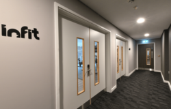
Throughout healthcare environments doors should be recognisable from a distance with frames defining the opening. Vision panels within the door can aid the user in understanding the function of the room. This is particularly effective in corridors that branch out to multiple rooms to help distinguish between usable doors, restricted areas, and maintenance cupboards. Being able to identify doors quickly and effectively reduces hesitation and confusion and aids evacuation efforts in the event of a fire.
Ironmongery visibility
Users must be able to identify the door handles before reaching the door, as this allows them sufficient time to determine how the door opens. Low-contrast hardware such as stainless steel on grey, black on dark timber, or colour-matched pulls should be avoided, as the lack of contrast causes uncertainty and difficulty. Using lever handles on doors frequented by patients is ideal, as the operation of the lever is far more intuitive and easier to distinguish.
Handrails and guarding
The primary function of handrails is for support and safety, but they can play a key role in navigation. Continuous rails reinforce routes and give users a clear path to follow. These rails should contrast with the wall background, and avoid breaks in the rails which can interrupt spatial understanding or lead to falls if the user unexpectedly loses the support.
Signage
Clear wayfinding is the priority, but signage is still important throughout healthcare environments to confirm decisions rather than creating them. Environmental cues must lead users first, with signs to back up the visual clues. Over-reliance on signs can increase confusion, or, due to users being under stress, they can be misread or missed entirely.
Planning wayfinding early in the design process
Correct accessibility requires multi-discipline coordination which impacts architectural layouts, interior finishes, doorsets, ironmongery, access control and signage. Making wayfinding decisions earlier on prevents late adjustments or poor coordination. Specifiers can use door colours to zone departments alongside hardware colours and styles that are easy to identify and operate. When planning the door layouts and design, considering glazing from the offset can allow architects and specifiers to ensure clear wayfinding and achieve the desired aesthetic for the space. Wayfinding doesn’t need to be the enemy of interior design, when it’s accounted for from the start, the two can work together to create safe spaces that look great. Adding in automation for busier areas such as receptions and main corridors can remove many wayfinding challenges while reducing general congestion during peak times. Wayfinding works best as a system that covers the entire building’s design, not individual products.
Suttons Wharf Health Centre
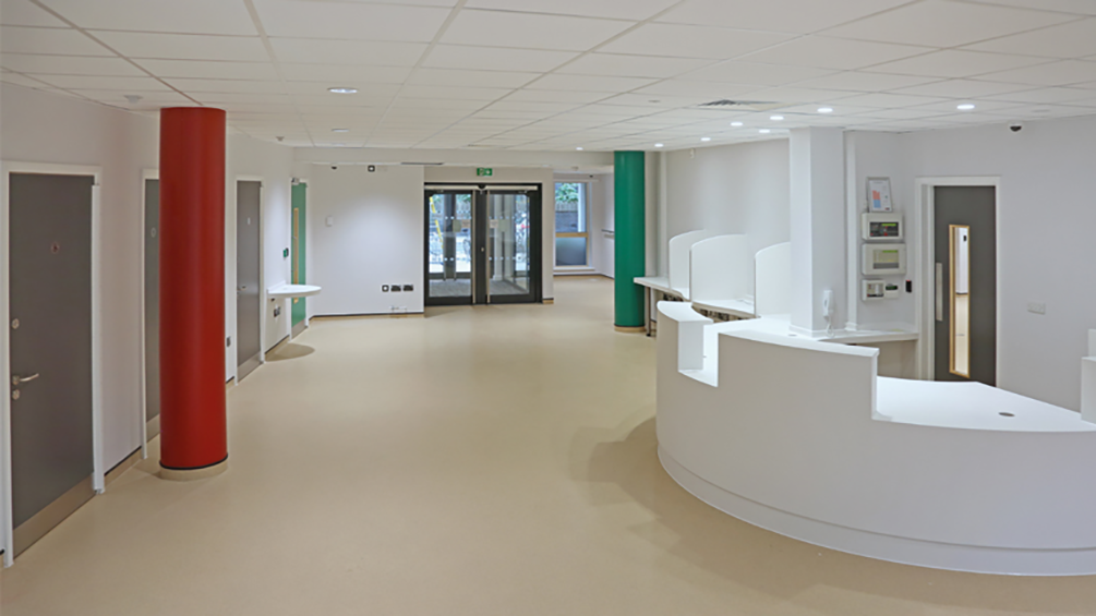
Our work at Suttons Wharf Health Centre shows how colour contrast and navigation can be designed into a building from day one. The busy GP surgery includes consultation rooms, treatment areas, staff spaces and public circulation routes, all requiring clear, intuitive movement for patients and staff.
Over 70 laminated-faced doorsets were supplied in a mix of fire-rated, non-fire-rated and acoustic constructions. Four laminate colours (Storm Grey, Amarena Pink, Spectrum Green and Spectrum Blue) were used to visually differentiate room functions, helping users recognise destinations without relying solely on signage.
Consistent ironmongery and predictable door operation improved user confidence, while sliding and assisted WC doors removed physical barriers. Integrated access control and automatic operators supported independent movement through key routes.
The result was a healthcare environment where wayfinding, accessibility and compliance were built into the architecture rather than added afterwards.
Accessibility works best when people don’t have to think about it
BS 8300 is not just about passing inspection; it’s about helping users instinctively understand a space. Clear contrast, consistent door behaviour and intuitive navigation reduce stress, improve flow and minimise staff intervention.
By embedding accessibility into doorsets and hardware from the outset, specifiers can avoid retrofits, reduce risk and create environments that work naturally for everyone, not just those who need adjustments, but every person who walks through the door.
Our expert team are on hand for all your wayfinding, doorset, automation and signage needs; just get in touch: https://www.lloydworrall.co.uk/contact/
Back To News